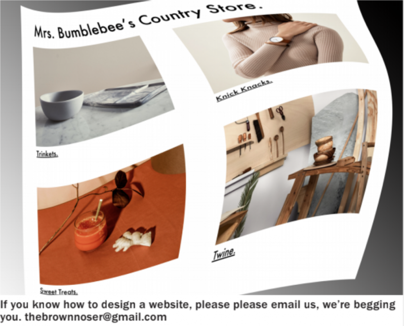
According to recent user Yasmin Perogotta, the new online shop for Mrs. Bumblebee’s Country Store is a minimalist hellscape powered by Squarespace.
“I love the hominess of the cluttered wooden shelves and pattered carpets whenever I shopped at Mrs. Bumblebee’s," said Perogotta as she opened the store’s soul-sucking website which had an all-white minimalist theme designed by Squarespace. “But their website is just a barren, emotionless void that could only be forged in the netherworld.”
“In the physical store, I could browse the aisles all day looking for the perfect little trinket," continued Perogotta, scrolling down the page of individually photographed items, all ordered in an eerily perfect grid made possible by Squarespace. “But online, the flat, sans-serif fonts make the shopping experience feel like I’m condemned to a deep abyss for the damned.”
“There was nothing better than chatting with Mrs. Bumblebee after I was finished shopping," added Perogotta, reaching the check-out window which already had her information using auto-fill technology created by Squarespace. “Now, I’m ushered through a series of stripped-down text boxes that spit me out the other side like I’ve traveled across a virtual River Styx."
At press time, a local restaurant’s mobile ordering system turned it into dystopian post-industrial assembly line made possible by Grubhub.

